Redesigned Telychko's student-facing LMS in 2 weeks, creating a clean, modern interface with dark/light modes and a proper landing page for ad campaigns. The new design streamlined flows, improved conversion, and delivered a credible platform ready for launch.

Product
Web app (desktop + mobile)
Domain
EdTech (frontend development courses)
Client
Telychko frontend lab
Role
Product Design Lead (with 1 junior designer)
Activities
Metrics
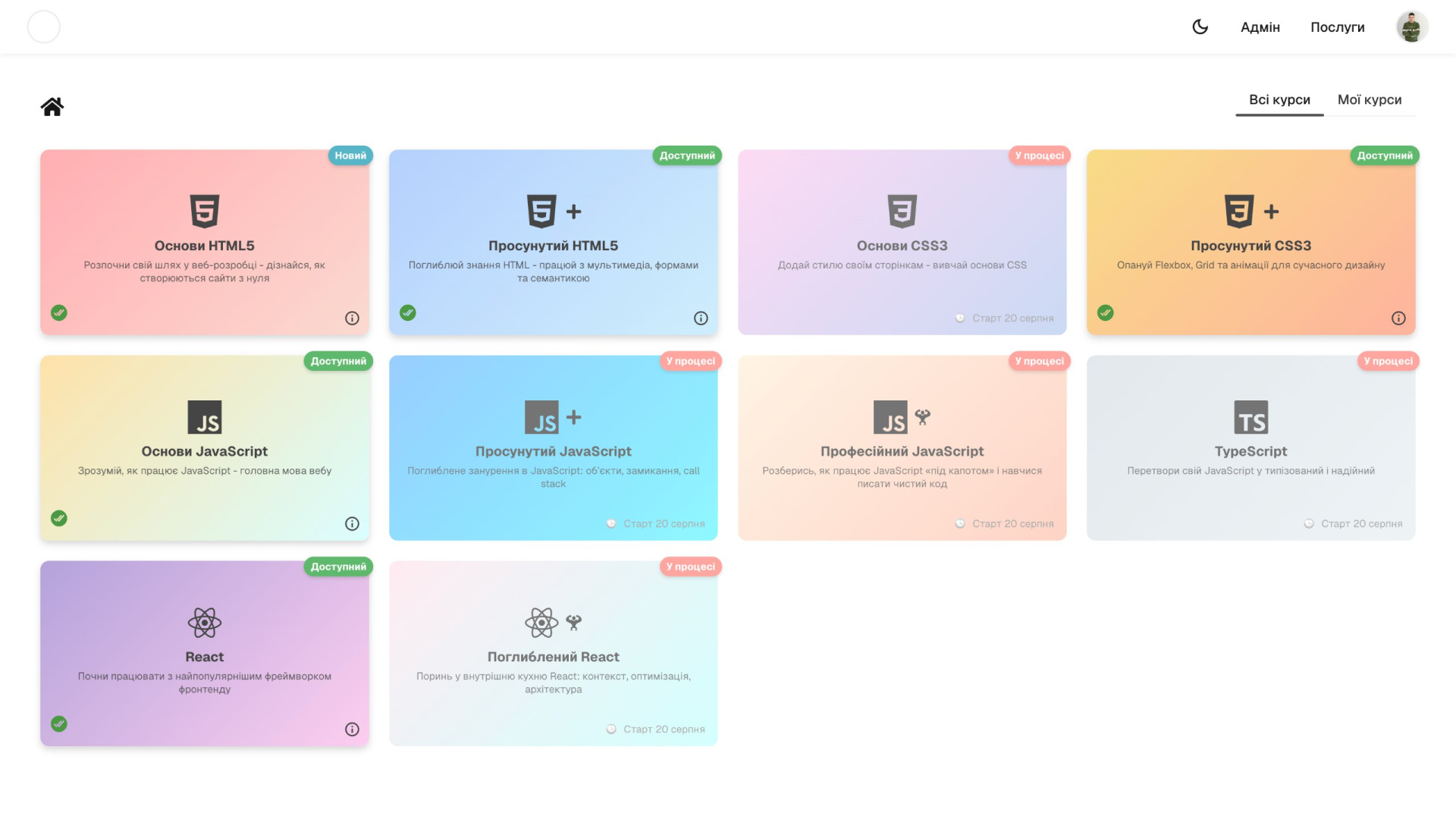
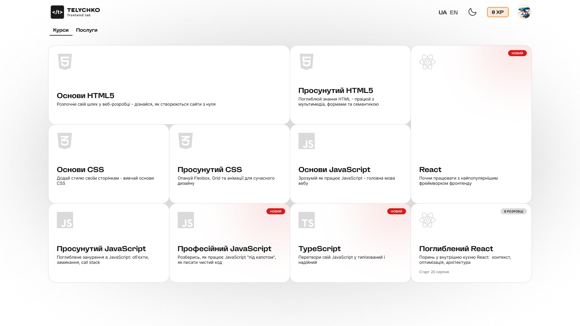
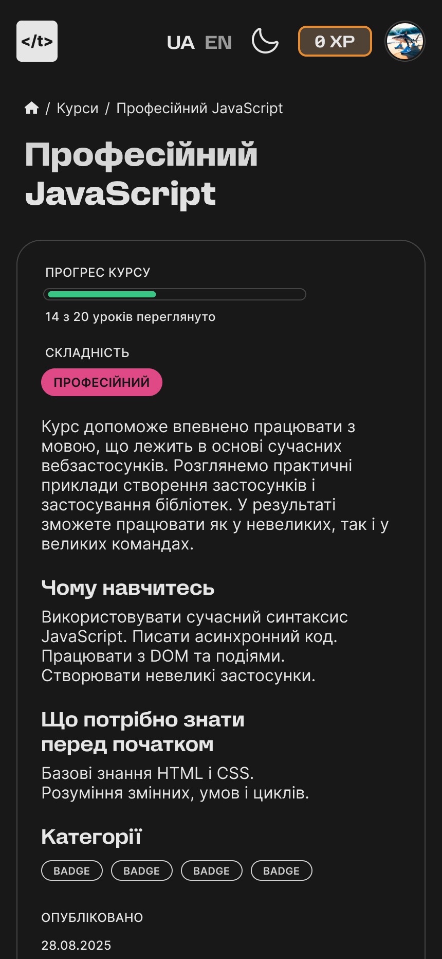
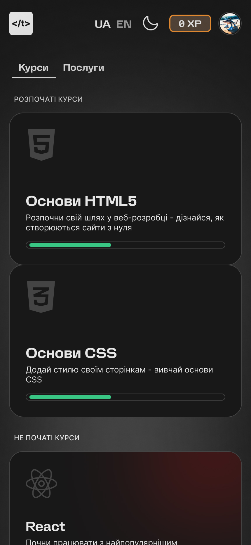
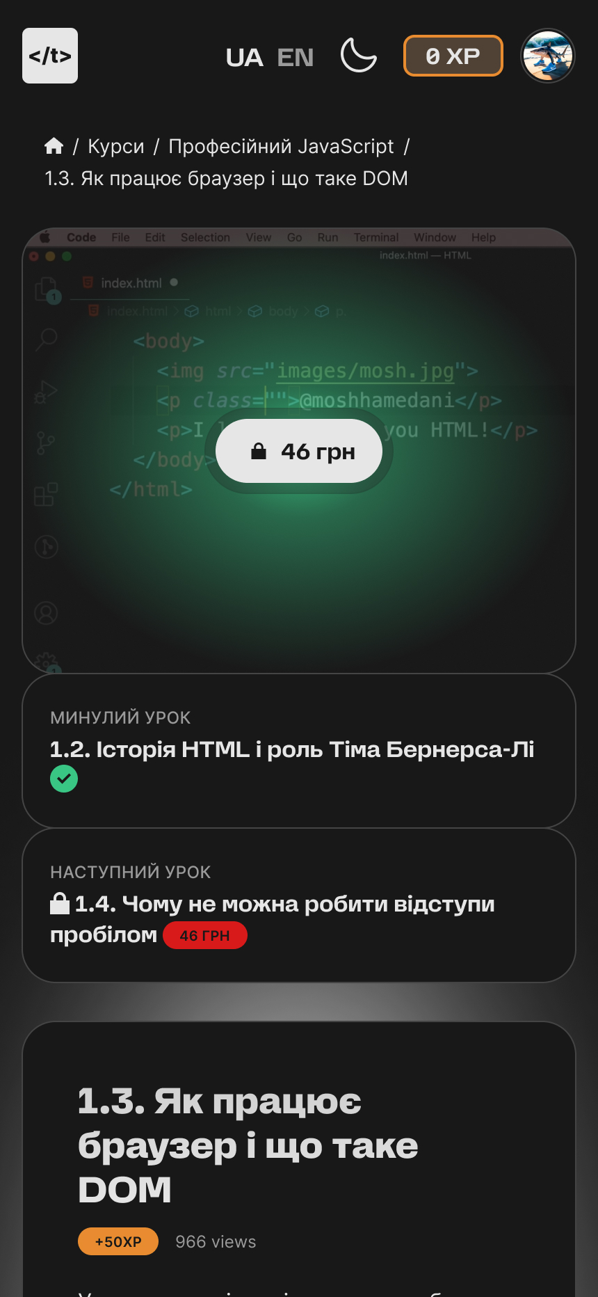
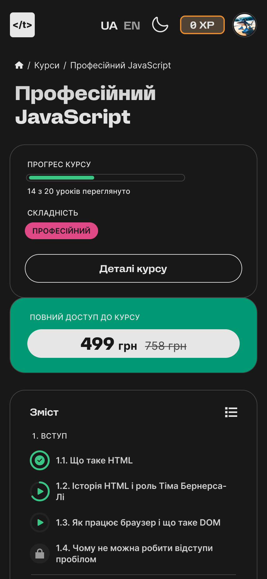
"No one believes you teach frontend well if your interface looks bad." The client needed to kickstart a set of 10 online frontend courses with a small LMS. The first version, built quickly in Next.js, was inefficient — risking low trust from prospective students. The client required a modern, minimal interface in both light and dark modes, with final mockups in 2 weeks to match development speed.
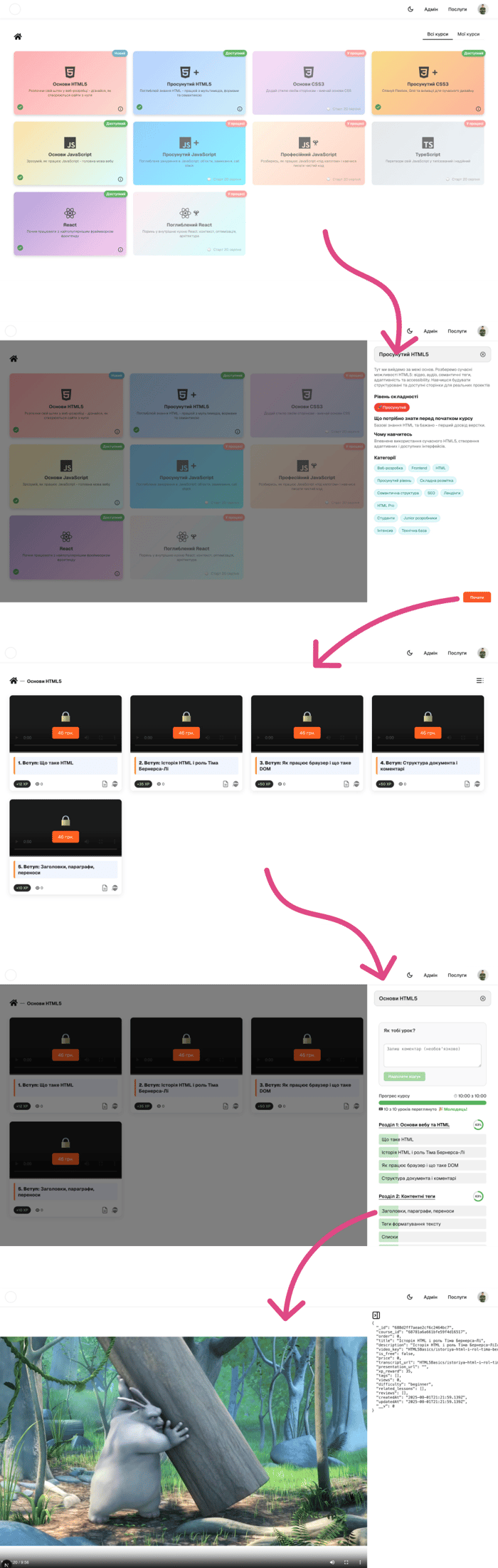
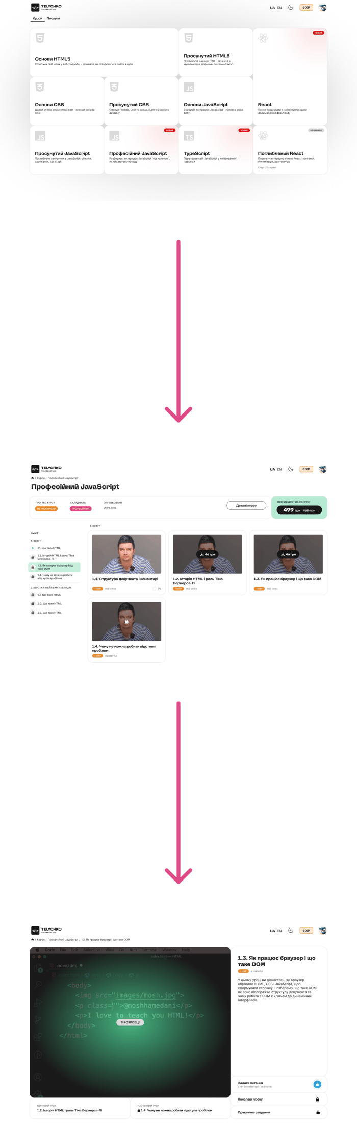
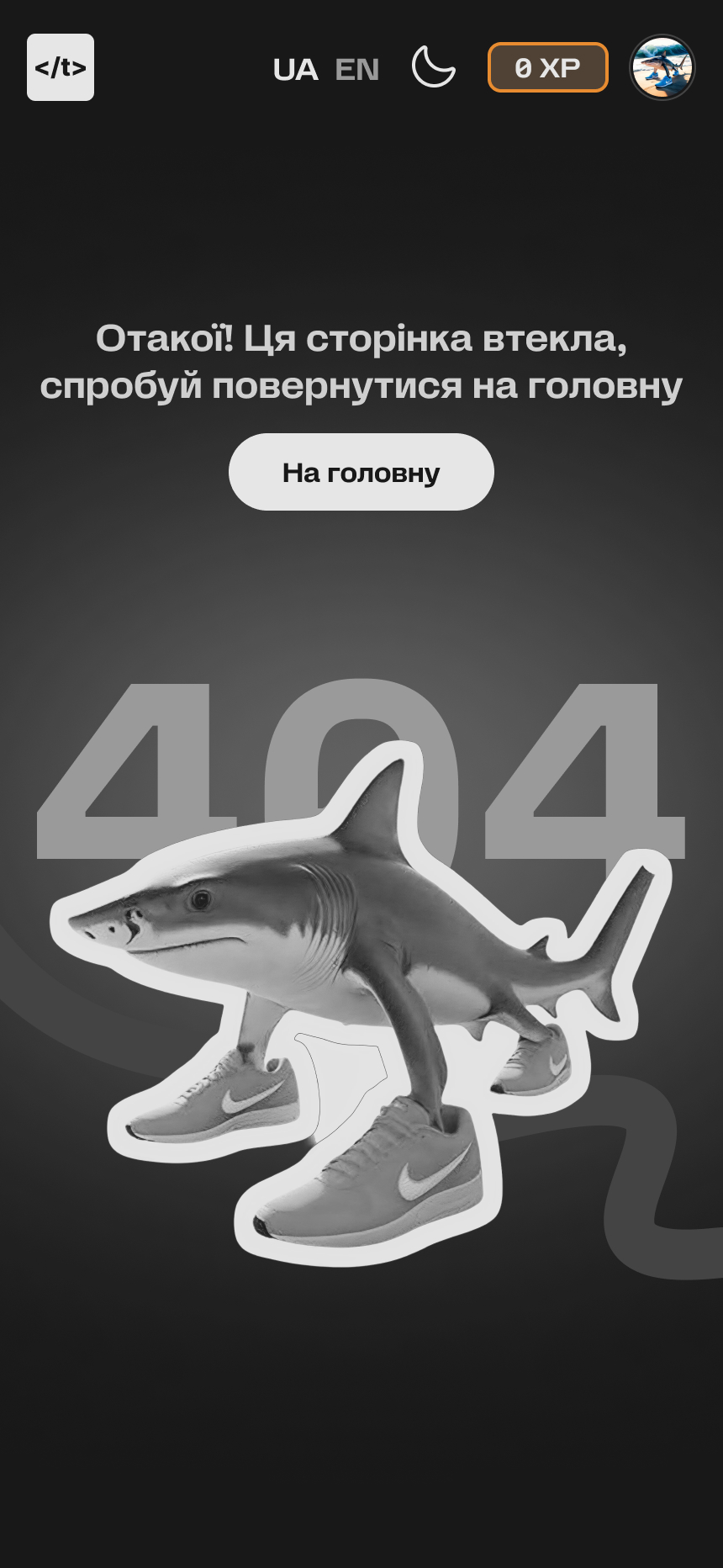
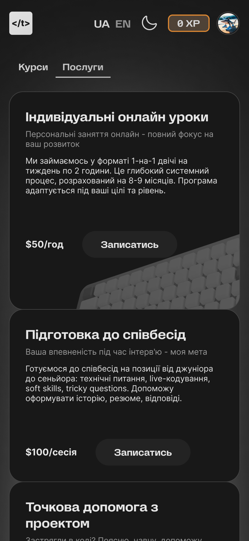
We built a UI kit from scratch and redesigned the student-facing interface: the catalog, course page, lesson page, user profile, landing page. A clickable prototype helped validate the flow with stakeholders and test users.